Dojo - charting
In my previous blog, I explained how drag and drop functionality works in Dojo. If you missed it, you can read the blog post here. In this blog, I will discuss another great feature from Dojo, namely ‘charting’. Charting isn’t being used by EPiServer. In my custom solution (mentioned in my previous blog) I’m using charting package from Dojo. Charting is not a small package in Dojo and impossible to explain in only one post, so I will explain only the basics. As how I do normally I’ve build a demo to better explain how it works. With the demo, you can choose different kind of charts, set some basic properties and use action and effects. It’s a small playground to get a feeling of the chart features in Dojo. Of course, this demo is available on my GitHub account and on JSFiddle.
Charts
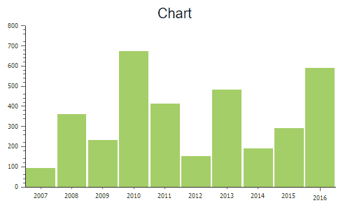
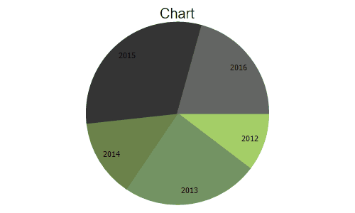
Dojox is a separate package from Dojo that offers additional functionality. This package will probably move to the Dojo Core in the future. One of the functionality of the Dojox package is charting. This package contains all the modules/utils, etc to build your own chart. The following type of charts are available: lines, areas, markers, bars, columns, bubble, pie, spider, grid and indicator. The charting package will give you the opportunity to basically modify the whole chart from styling until behavior and animation. Let’s start with the basics.
Basics
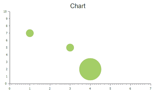
For the demo, I’ve created four different type of charts: line, column, pie and bubble. Most of the charts have similar functionality like axes, theme, styling and some basic properties like the title of the chart. In my previous blog, I already explained how a Dojo module can be created so I will skip this for now. In the code snippet below, the renderChart method is called when the generate button is clicked. The Chart class accepts a HTML element or id. In this HTML element the chart will be created. You can set a theme for the chart by calling the setTheme method. The Dojox package contains more than 30 different themes that can be used immediately. Beside of the Dojox themes. it is also possible to create your own custom theme.
renderChart: function(chartType) {
                this.clearChartsContainer();

                var chartElement = domConstruct.create("div", { class: "chart" }, this.chartsContainer);
                var chart = new Chart(chartElement);
                chart.title = this.titleTextBox.value;
                chart.titlePos = this.titlePositionDropDownSelect.value;
                chart.titleGap = 10;
                chart.titleFont = "20px Myriad,Helvetica,Tahoma,Arial,clean,sans-serif";
                chart.titleFontColor = "#000";

                chart.setTheme(dojo.getObject("dojox.charting.themes." + this.themeDropDownSelect.value));

                switch(chartType)
                {
                    case "Line":
                        chart = this.renderLineChart(chart);
                        break;
                    case "Columns":
                        chart = this.renderColumnsChart(chart);
                        break;
                    case "Pie":
                        chart = this.renderPieChart(chart);
                        break;
                    case "Bubbles":
                        chart = this.renderBubbleChart(chart);
                        break;
                }
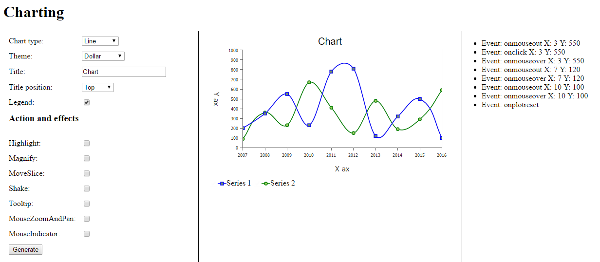
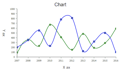
The renderLineChart method does what the name indicates. The addPlot method defines the type of chart you want to use. First, define a name for your plot, it is possible to have more then one plot type per chart. The second parameter is an array of settings. For example, I set the tension to ‘X’, which means that a curved line will be generated. Most of the chart types contain a X (horizontal) and Y (vertical) ax. An ax can be automatically generated by Dojox, look at my Y ax. I tell Dojox to generate a vertical ax with the values from 1 until max 1000 depending of the dataset. For the X ax I’ve defined an array that represents the labels. The array should contain a value and text for each label item. The last step is the actual data. I’ve defined two data sets, both an array with some random numbers. For each data set, a serie can be defined by calling the addSeries method. Each serie should have a unique name.
renrLineChart: function(chart) {
chart.addPlot("default", { type: "Lines", tension: "X", markers: true });
var lineChartXaxisData = [
{value: 1, text: "2007"},
{value: 2, text: "2008"},
{value: 3, text: "2009"},
{value: 4, text: "2010"},
{value: 5, text: "2011"},
{value: 6, text: "2012"},
{value: 7, text: "2013"},
{value: 8, text: "2014"},
{value: 9, text: "2015"},
{value: 10, text: "2016"}];
var lineChartDataSet1 = [200, 350, 550, 230, 780, 810, 120, 320, 499, 100];
var lineChartDataSet2 = [90,360, 230, 670, 410, 150, 480, 190, 290, 590];
chart.addAxis("y", { min: 1, max: 1000, vertical: true, fixLower: "major", fixUpper: "major", microTicks: false, minorTicks: false, title: "Y ax", titleOrientation: "away" });
chart.addAxis("x", { labels: lineChartXaxisData, title: "X ax", titleOrientation: "away", microTicks: false, minorTicks: false });
chart.addSeries("Series 1", lineChartDataSet1, { stroke: { color: "blue"} });
chart.addSeries("Series 2", lineChartDataSet2, { stroke: { color: "green"} })
return chart;
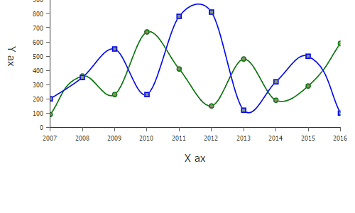
},After all methods and properties are set on the chart object, the render method is called for the actual rendering.
chart.render(); 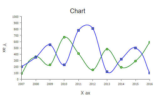
Action and effects
The Dojox package contains so much more functionality, one is action and effects. There are some predefined actions that can be used out-of-the-box. Not all actions and effects are supported by all chart types. For instance, you can not use the Shake action on a line chart. Let me cover them all: Highlight: change the color of individual elements of the chart. For example a column chart, it will change the color of the element on mouse hover.
Magnify: magnifies an element when hovering over the item of the chart. In a pie chart, each slice will be magnified.
MoveSlice: moves slices out from a pie chart.
Shake: shakes elements of the chart when the user hover over them. For example, a bubble of a bubble chart will be shaken.
Tooltip: when a user hovers over a chart element a tooltip appears with information about the element. The claro.css must be referenced.
MouseZoomAndPan: user can zoom in and pan the chart while dragging the mouse over it.
MouseIndicator: will display a data indicator when the user moves the mouse over the chart.
The code for implementing action and effects can be found on my Github account.
Events
Events are fired when the user click or hover over a chart element. These events can be caught: onclick, onmouseover, onmouseout and onplotreset. An event handler can be defined by calling the connectToPlot method. The first parameter is the name of the plot (can have multiple plots per chart), the second parameter is the function that should be called when events are fired. The evt parameter of the defined function contains information like type of the event, data of the element, etc.
chart.connectToPlot("default",
                    lang.hitch(this, function(evt) {
                            var text = "Event: " + evt.type;
                            if(evt.type == "onmouseout" || evt.type == "onmouseover" || evt.type == "onclick")
                            {
                                text += " X: " + evt.x + " Y: " + evt.y;
                            }
                            domConstrauct.create("li", { innerHTML: text }, this.eventList, "first");
                        })
); Using the charting package from Dojo isn’t that hard. There are different chart types available. The charts can be implemented the same way, of course, some charts have specific functionality. What do you need for building a chart:
- Choose a chart type, line, pie, column, etc.
- Define basic properties such as the title, padding, etc.
- Call the addPlot method.
- Define axes, most of the time a X and Y ax.
- Collect and define your data by calling the addSeries method.
- Optional: use animation and effects.
- Call the render method.
You can find the source code on my GitHub account and on JSFiddle. Next blog, the custom solution for viewing page statistics in EPiServer.
 Twitter
 LinkedIn
 GitHub